A blog on statistics, methods, philosophy of science, and open science. Understanding 20% of statistics will improve 80% of your inferences.

Tuesday, September 30, 2014

What p-hacking really looks like: A comment on Masicampo & LaLande (2012)

[a slightly adapted version of this blog post is now in press at QJEP: see https://osf.io/ycag9/ for the manuscript and R scripts]

In this blog, I'll explain how p-hacking will not lead to a peculiar prevalence of p-values just below .05 (e.g., in the 0.045-0.05 range) in the literature at large, but will instead lead to a difficult to identify increase in the Type 1 error rate across the 0.00-0.05 range. I re-analyze data by Masicampo & LaLande (2012), and try to provide a better model of the p-values they have observed through simulations in R (code below). I'd like to thank E.J. Masicampo and Daniel LaLande for sharing and allowing me to share their data, as well as their quick response to questions and a draft of this post. Thanks to Ryne Sherman for his p-hack code in R, to Nick Brown for asking me how M&L's article related to my previous blog post and for comments and suggestions on this post, and Tal Yarkoni for feedback on an earlier draft.


Masicampoand LaLande (2012; M&L) assessed the distribution of all 3627 p-values between 0.01 and 0.10 in 12 issues of the three journals. Exact p-values were calculated from t-tests and F-tests. The authors conclude “The number of p-values in the psychology literature that barely meet the criterion for statistical significance (i.e., that fall just below .05) is unusually large”. “Specifically, the number of p-values between .045 and .050 was higher than that predicted based on the overall distribution of p.”

There are four factors that determine the distribution of p-values:
1) the number of studies examining true effect and false effects
2) the power of the studies that examine true effects
3) the frequency of Type 1 error rates (and how they were inflated)
4) publication bias.

Due to publication bias, we should expect a substantial drop in the frequency with which p-values above .05 appear in the literature. True effects yield a right-skewed p-value distribution (the higher the power, the steeper the curve. e.g., Sellke, Bayarri, & Berger, 2001). When the null-hypothesis is true the p-curve is uniformly distributed, but when the Type 1 error rate is inflated due to flexibility in the data-analysis, the p-value distribution could become left-skewed below p-values of .05.

M&L model p-values based on a single exponential curve estimation procedure that provides the best fit of p-values between .01 and .10. This is not a valid approach because p-values above and below p=.05 do not lie on a continuous curve due to publication bias. It is therefore not surprising, nor indicative of a prevalence of p-values just below .05, that their single curve doesn’t fit the data very well, nor that Chi-squared tests show the residuals (especially those just below .05) are not randomly distributed.

P-hacking does not create a peak in p-values just below .05. Actually, p-hacking does not even have to lead to a left-skewed p-value distribution. If you perform multiple independent tests in a study, the p-value distribution is uniform, as if you had performed 5 independent studies. The right skew emerges through dependencies in the data in a repeated testing procedure. For example, collecting data, performing a test, collecting additional data, and analyzing the old and additional data together.

Figure 1 (left pane) shows p-value distributions when H0 is true and researchers perform a test after 50 participants, and collect 10 additional participants for a maximum of 5 times, leading to a 15.4% Type 1 error rate, or (right pane) compare a single experimental condition to one of five possible control conditions, leading to a Type 1 error rate of 18.2%. Only 5000 out of 100000 studies should yield a p<.05, but we see an increase (above 500 for each of the 10 bins) across the range from .00 to .05. 


Identifying a prevalence of Type 1 errors in a large heterogeneous set of studies is, regrettably, even more problematic due to the p-value distribution of true effects. In Figure 2 (left) we see a p-distribution of 100000 experiments with 50% power. Adding the 200000 experiments simulated above give the p-value distribution on the right. Even when only 1/3rd of the studies examines a true effect with a meager 51% power, it is already impossible to observe a strong left-skewed distribution.


Do frequencies of p-values just below p=.05 observed by M&L indicate extreme p-hacking in a field almost devoid of true effects? No. The striking illustration of the prevalence of p-values in Psychological Science just below .05 (Figure 3, right, from M&L) from the blind rater is not apparent in the data coded by the authors themselves (Figure 3, left, re-analysis based on the data kindly provided by M&L). It is unclear what has led to the difference in coding by the authors and the blind rater, but the frequencies between .03 and .05 look like random variation due to the relatively small number of observations.


There is also no evidence of a pre-valence of p-values just below .05 when analyzing all p-values collected by M&L. The authors find no peak when dividing the p-values in bins of .01, .005, or .0025, and there is only a slight increase in the .04875-.05 range. There should be a similar increase in the .0475-.04875 range, which is absent, and it is easier to explain this pattern by random variation than by p-hacking.

As an example of a modeling approach of the p-value distribution based on power, Type 1 error rates and p-hacking, and publication bias, I’ve simulated 11000 studies with 41% power, taking into account publication bias by removing half of the studies with a p>.05, and added 4500 studies examining no real effect with an inflated Type 1 error rate of 18.2% (using the example above where an experimental study is compared to one of 5 control conditions). The R-script is available below. I do not mean to imply these parameters (the relative number of studies examining true vs. non true effects, power, the effect of publication bias, and the inflated Type 1 error rate) are typical for psychology, or even the most likely values for these parameters. I only mean to illustrate that choosing values for these four parameters is able to quite accurately simulate the p-value distribution actually observed by M&L. The true parameters require further empirical investigation. One interesting difference between my model and the observed p-values is a slight increase of p-values just above .05 – perhaps some leniency by reviewers to tend to accept studies with p-values that are almost statistically significant.
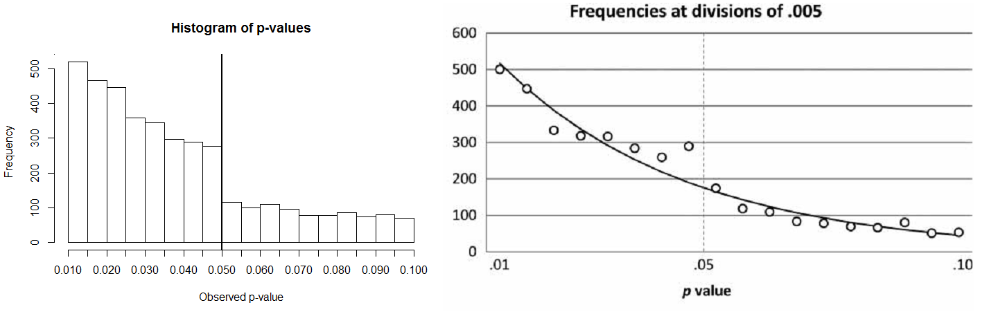


Even though 839 of the 3877 simulated p-values are Type 1 errors (614 of which are only significant through p-hacking) there is no noticeable prevalence of p-values just below .05. It is clear that p-hacking can be a big problem even when it is difficult to observe. As such, the findings by M&L clearly indicate publication bias (a large drop in p-values >.05), but do not necessarily identify a surprising prevalence of p-values just below .05, when interpreted against a more realistic model of expected p-value distributions. Concluding that p-hacking is a problem by analyzing a large portion of the literature is practically impossible, unless there are a huge amount of studies that use extreme flexibility in the data analysis.

An alternative to attempting to point out p-hacking in the entire psychological literature is to identify left-skewed p-curves in small sets of more heterogeneous studies. Better yet, we should aim to control the Type 1 error rate for the findings reported in an article. Pre-registration and/or replication (e.g., Nosek & Lakens, 2014) are two approaches that can improve the reliability of findings. 

You can download the data here (which E.J. Masicampo and Daniel LaLande gratiously allowed me to share). Store it at C:// and the code below will produce the left pane of Figure 3:

library(foreign)
dataSPSS<-read.spss("C:/ML_QJEP2012_data.sav", to.data.frame=TRUE)
hist(dataSPSS$PS, xaxt="n", breaks=20, main="P-values in Psychological Science from M&L", xlab=("Observed p-value"))
axis(side = 1, at = c(0.01, 0.02, 0.03, 0.04, 0.05, 0.06, 0.07, 0.08, 0.09, 0.10))
abline(v=0.05, lwd=2)

The R-code for the simulations in Figure 1 and 2 (Thanks to Ryne Sherman's p-hack script):
The R-code for the simulations in Figure 4:

References:


Masicampo, E. J., & Lalande, D. R. (2012). A peculiar prevalence of p-values just below. 05. The Quarterly Journal of Experimental Psychology, 65(11), 2271-2279.
Nosek, B. A., & Lakens, D. (2014). Registered reports: A method to increase the credibility of published results. Social Psychology, 43, 137-141. DOI: 10.1027/1864-9335/a000192.
Sellke, T., Bayarri, M. J., & Berger, J. O. (2001). Calibration of p-values for testing precise null hypotheses. The American Statistician, 55,62–71.
 

Wednesday, September 24, 2014

Publication Bias in Psychology: Putting Things in Perspective

I'd like to gratefully acknowledge the extremely helpful comments and suggestions by Anton Kühberger and his co-authors on an earlier draft of this blog post, who patiently answered my questions and shared additional analyses. I'd also like to thank Marcel van Assen, Christina Bergmann, JP de Ruiter, and Uri Simonsohn for comments and suggestions. Any remaining errors are completely my own doing.

In this post I'll be taking a closer look at recent support for publication bias in psychology provided by Kühberger et al (2014). I'll show how it is easy to misinterpret some of their data, and how p-curve analyses of their data show strong evidential support for the underlying studies (with no signs of p-hacking). Finally, I'll illustrate recently developed techniques (Simonsohn et al., in press) to estimate the power of studies based on the p-curve distribution, and check these estimates using Z-score simulations in R.

Publication bias is a problem in science (Everyone, 1950-2014). It’s difficult to quantify the extent of the problem, and therefore articles that attempt to do this can be worthwhile. In a recent paper ‘Publication Bias in Psychology: A Diagnosis Based on the Correlation between Effect Size and Sample Size’ Kühberger, Fritz, and Scherndl (2014) coded 1000 articles in psychology and examined the presence of publication bias. 531 articles ended up in the dataset, and they were able to extract p-values and effect sizes from around 400 studies. I tweeted a picture from their article, showing a distribution of Z-scores that, as the authors conclude, ‘shows a peak in the number of articles with a Z-score just above the critical level, while there are few observations just below it.’


It’s easy to misinterpret this figure (I know I did) if you believe the bump around Z=1.96 should mean there are a surprising number of just significant p-values. I’ve spent time on my blog to explain how a healthy distribution of p-values should look like: We should not find a high number of p-values around 0.05 (or a Z=1.96), but a large number of low p-values, for example as in the graph below:


You might be surprised to hear that the p-values and Z-scores in both figures above are exactly the same data (although I’ve only plotted the p-values below 0.1), presented in a different way. In the graph below, you see the relationship between p-values (from 1 to 0) and Z-scores. As you see, the lower the p-value, the higher the Z-score (in excel, Z=NORMSINV(1-p/2). However, Z-scores do not increase linearly, but in a concave upward function.


If you look at the Figure 6 by Kühberger above, you will see they have plotted Z-scores as a linear function (from 0 to 9.80 and higher, in bars of equal width. Let’s plot Z-scores (and their associated p-values) linearly, starting at Z=1.96 (p=0.05) and going upward. Both Z-scores and p-values are presented in the top pane, but because the p-values are almost not visible, these are plotted in isolation in the bottom pane.

The main point the authors want to make is the strong drop to the left of the 1.96 Z-score (indicating much less non-significant than significant results in the literature). And I was looking at the drop to the right of the figure, which can be perfectly normal (once you understand how to interpret it). The first bar (Z=1.96-2.205) contains p-values between p = 0.05 and p = 0.0275 (a width of 0.0225), the bar to the right  (Z=2.025-2.45) p-values between p = 0.0275 and p = 0.0143 (a width of 0.0132), the bar to the right  (Z=2.45-2.695) p-values between p = 0.0143 and p = 0.007 (a width of 0.0073), the bar to the right  (Z=2.695-2.94) p-values between p = 0.007 and p = 0.0033 (a width of 0.0037), etc. Depending on the power of the studies, the shape of the curve on the right side could be perfectly expected without a peculiar pre-dominance of p-values just below the traditional significance level. I’ll return to this in the end.

So, based on the distribution of p-values I can correct my earlier tweet: There are not too many just-significant p-values compared to very significant p-values, but there are too many significant p-values compared to non-significant p-values. The authors suggest nothing more.

One thing that has greatly contributed to my expectation of a bump around p = .05 are pictures of the prevalence of p-values based on google searches, such as the ones below by Matthew Hankins on Twitter:


If we compare these searches based on the hand-coded p-values by Kühberger et al (2014) we can be relatively certain the google scholar search p-curves are completely due to an artefact of the search method (where people very often report p < .05 or p < .1 instead of precise p-values). Nevertheless, and despite Matthew Hankins warning against this, this spreads the idea through the community that there is something very wrong with p-curves across science, which is not just incorrect, but damaging the reputation of science. A picture says more than a 1000 words - and posting pictures of search method artefacts on social media might not be the thing we need now that many scienctist are becoming overly skeptical and see p-hacking everywhere.

Kühberger et al (2014) provide Z-scores for 344 significant and 66 non-significant Z-scores. We can easily perform a p-curve analysis on these Z-scores, which yields the pattern below, illustrating strong evidential value for studies with N’s larger than 100, χ²(258)=826.46, p=<.0001, as well as for studies with N’s smaller than 100, χ²(428)=1185.78, p=<.0001. Researchers are not just reporting false positives in a scientific environment where publication bias reigns. Yes, there is probably some publication bias, and who knows whether there are specific research areas in this large set of studies were a lot of the results are p-hacked, but in general what ends up in the literature seems to have something going for it. I’d say it’s a pretty good looking p-curve for a random selection of psychology articles.


We can count the percentage of significant studies in small studies (N ≤ 100) and in large studies (N > 100). In 152 small studies, 84.21% of the p-values were smaller than p = 0.05. In 259 large studies, 84.17% of the p-values were smaller than p = 0.05. This is too similar. Because smaller studies typically have lower power, we should expect at least slightly more non-significant results – another indication of publication bias, in addition to the missing Z-values to the left of the 1.96 threshold.


The central observation in Kühberger et al (2014) was actually not the distribution of p-values, but the correlation between effect size and sample size. The authors state that ‘ES and sample size (SS) ought to be unrelated.’ This is true when people completely ignore power. Note that if researchers would take power into account when designing an experiment, power and sample size should be related: The smaller the effect size, the larger the sample you need to collect to have a decent probability of observing it). An interesting aspect about the data Kühlberger et al have collected, is that the negative correlation between the sample size and effect size is mainly drive by small groups (N<100), but remains stable across larger sample sizes.


This indeed points to actual publication bias. For an r = 0.3, a power analyses tells us you have 95% power with a sample size of 134 – around the sample size where the negative correlation disappears. Another possibility is the use of within-subject designs. These studies rarely collect more than 100 individuals, but they typically don’t have to, because they often have higher power than between subject designs. In an e-mail, the authors presented additional analyses, which suggest that the effects are indeed smaller for within designs, but don’t completely disappear.

Kühberger et al (2014) asked the authors of the studies they sampled to estimate the direction and size of the correlation between sample size and effect size in the data they had collected. Because the contacted authors had no idea, Kühberger et al (2014) concluded power considerations by the original authors were ‘unlikely as the source of a possible ES-SS relationship’. I don’t think this question is conclusive about a lack of power considerations. After all, researchers will probably not have been able to define the meaning of a p-value, which doesn’t mean significance considerations played no role in the studies. It’s difficult to measure whether researchers took power into account, and direct questions would probably have led to socially desirable answers, so at least the authors tried, but it's an interesting question to what extent people design studies in which power is (at least implicitly) taken into account.

On a slightly more positive note, the estimated percentage of negative results in the psychological literature (15.78%) is much greater than in other estimates in the literature (e.g., the 8.5% reported by Fanelli, 2010).

Estimating the power of the studies


Remember that the distribution of p-values is a function of the power of the studies. We should therefore be able to estimate the power of the set of studies for N < 100 and N > 100 based on the p-curve we observe. When we plot the p-curves for 53% power and 63% power, the distributions are quite comparable to the p-curves observed based on the data by Kühberger.


This visual comparison is nice to communicate the basic idea, but a more formal mathematical approach is better. Simonsohn, Nelson, & Simmons (in press) have recently extended the use of p-curve analyses in exactly this direction, and provide the R script to estimate the power of the studies.

If we enter all significant Z-scores, the estimated power estimate based on the p-curve distribution for all the studies is 90%. That's extremely high, mainly due to a decent number of studies that observed extremely low p-values (or high Z-scores). For example, 115 out of 410 p-values are p < .0001. The huge heterogeneity in the effects in the dataset by Kühberger et al (2014) is problematic for these kinds of analyses, but for illustrative purposes, I'm going to give it a go anyway.


There is a difference between my visual matching attempt and the mathematical matching by Simonsohn et al (2014). I’ve focused on matching the percentage of p-values between .00 and .01, while Simonsohn et al (2014) plot a function that matches the entire p-value distribution (including the higher p-values, and differences between p = 0.0001 and p = 0.00006). These decisions about which loss function to use leave room for debate, and I expect future research on these techniques will address different possibilities.

As mentioned above, the shape of the Z-score (or p-value) distribution depends critically on the power of the performed studies.We can simulate Z-score distributions in R by using the code below:

If we simulate Z-scores with 90% power, our picture does not look like the figure in Kuhberger et al (2014), because the peak is too far to the right:


Note that even with 90% power, our simulation expects much less Z-scores > 5 compared to the figure by Kühberger et al (2014). The heterogeneity in their study set makes it difficult to simulate using a single distribution. Normally you would examine heterogeneity in a meta-analysis by looking more closely at how the studies differ, but the studies in the dataset are not identified. So let’s resort to a more extreme solution of excluding the very high Z-scores (perhaps assuming these are manipulation checks or other types of tests) and only look at Z< 4, or p > 0.00006). We get a (probably more reasonable) power estimate of 51%.


It's clear that power estimations based on p-curve distributions with huge heterogeneity are difficult, and I'm expecting more future work on this technique that examine different ways to attempt this. However, simulating Z-scores with a power of 51% does lead to a distribution with a peak located closer to that observed in Kühberger et al (2014).

We can be reasonably certain all studies that we see to the right of Z=1.96 in the simulation, but are missing from Kühberger et al (2014) were performed, but are not reported. What a waste in resources! As such, the article by Kühberger is an excellent reminder of the negative consequences of performing underpowered studies (in addition to the difficulty of drawing statistical inferences from these studies, see Lakens & Evers, 2014).The missing studies would lower all effect size estimates that are calculated based on the published literature.

Below is the R-code to perform the power-estimation using the R-script by Simonsohn et al (you can find the original code here).

Monday, September 15, 2014

Bayes Factors and p-values for independent t-tests


This Thursday I’ll be giving a workshop on good research practices in Leuven, Belgium. The other guest speaker at the workshop is Eric-Jan Wagenmakers, so I thought I’d finally dive in to the relationship between Bayes Factors and p-values to be prepared to talk in the same workshop as such an expert on Bayesian statistics and methodology. This was a good excuse to finally play around with the BayesFactor package for R witten by Richard Morey, who was super helpful through Twitter at 21:30 pm on a Sunday to enable me to do the calculations in this post. Remaining errors are my own responsibility (see the R script below to reproduce these calculations).

Bayes Factors tell you something about the probability H0 or H1 are true, given some data (as opposed to p-values, which give you the probability of some data, given the H0). As explained in detail by Felix Schönbrodt here, you can express Bayes Factors as support for H0 over H1 (BF01) or as support for H1 over H0 (BF10), and report raw Bayes Factors (ranging from 0 to infinity, where 1 means equal support for H1 as H0) or Bayes Factors on a log scale (from minus infinity through 0 to plus infinity, where 0 means equal support for H1 as H0). And yes, that gets pretty confusing pretty fast. Luckily, Richard Morey was so nice to adjust the output of Jeff Rouder's Bayes Factor calculation website to include the R script for the BayesFactor package, which makes the output of different tools to compute Bayes Factors more uniform.

Doing a single Bayes independent t-test in R is easy. Run the code below, and replace the t with the t-value from your Student's t-test, fill in n1 and n2 (the sample size in each of the two groups in the independent t-test) and you are ready to go. For example, entering a t-value of 3, and 50 participants in each condition gives BF10 = 0.11, indicating the alternative hypothesis is around (1/0.11) = 9 times more likely than the null hypothesis.

exp(-ttest.tstat(t,n1,n2,rscale=1)$bf)

In the figure below, raw BF01 are plotted, which means they indicate the Bayes Factor for the null over the alternative. Therefore, small values (closer to 0) indicate stronger support for H1, 1 means equal support for H1 and H0, and large values indicate support for H0. First, let’s give an overview of Bayes Factors as a function of the t-value of an independent t-test, ranging from t=0 (no differences between groups) to t=5.


You can see three curves (for 20, 50, or 100 participants per condition) displaying the corresponding Bayes Factors as a function of increasing t-values. The green lines correspond to Bayes Factors of 1:3 (upper line, favoring H0) or 3:1 (lower line, favoring H1). Bayes Factors, just like p-values, are continuous, and shouldn’t be thought of a dichotomous manner (but I know polar opposition is a foundation of human cognition, so I expect almost everyone will ignore this explicit statement in their implicit interpretation of Bayes Factors). Let’s zoom in a little for our comparison of BF and p-values, to t-values above 1.96.


The dark grey line in this figure illustrates data in favor of H1 of 3:1 (some support for H1), and the light grey line represents data in favor of H1 of 10:1 (strong support for H1). The vertical lines indicate which t-values represent an effect in a t-test that is statistically different from 0 at p = 0.05 (the larger the sample size, the closer this t-value lies to 1.96). There are two interesting observations we can make from this figure. 

First of all, where smaller sample sizes require slightly higher t-values to find a p<0.05 (as indicated by the blue vertical dotted line being further to the right than the black vertical dotted line), smaller sample sizes actually yield better Bayes Factors for the same t-value. The reason for this, I think (but there's a comment section below, so if you know better, let me know) is that the larger the sample size, the less likely it is to find a relatively low t-value if there is an effect – instead, you’d expect to find a higher t-value, on average.

 P-values are altogether much less dependent on the sample size in a t-test. The figure below shows three curves (for 20, 50, and 100 participants per condition). Researchers can conclude their data is ‘significant’ for t-values somewhere around 2, ranging from 1.96 for large samples, to 2.03 for N=20. In other words, there is a relatively small effect of sample size. The dark and light grey lines indicate p = 0.05 and p = 0.01 thresholds.


The second thing that becomes clear from the plot of Bayes Factors is that the p<0.05 threshold allows researchers to conclude their data supports H1 long before a BF01 of 0.33. The t-values at which a Frequentist t-test yields a p < 0.05 are much lower than the t-values required for a BF to be lower than 0.33. For 20 participants per condition, a t-value of 2.487 is needed to conclude that there is some support for H1. A Frequentist t-test would give p=0.017. The larger the sample size, the more pronounced this difference becomes (e.g., with 200 participants per condition, a t=2.732 gives a BF = 0.33 and a p = 0.007).

It can even be the case that a ‘significant’ p-value in an independent t-test with 100 participants per condition (e.g., a t-value of 2, yielding a p=0.047) gives a BF>1, which means support in the opposite direction (favoring H0). Such high p-values really don’t provide support for our hypotheses. Furthermore, the use of a fixed significance level (0.05) regardless of the sample size of the study is a bad research practice. If we would require a higher t-value (and thus lower p-value) in larger samples, we would at least prevent the rather ridiculous situations where we interpret data as support for H1, when the BF actually favors H0. 

On the other side, the recommendation to use p<0.001 by some statisticians is a bit of an overreaction to the problem. As you can see from the grey line at p=0.01 in the p-value plot, and the grey line at 0.33 in the Bayes Factor plot, using p<0.01 gets us pretty close to the same conclusions as we would draw using Bayes Factors. Stronger evidence is preferable over weaker evidence, but can come at too high costs.

In the end, our first priority should be to draw logical inferences about our hypotheses from our data. Given how easy it is to calculate the Bayes Factor, I'd say that at the very minimum you should want to calculate it to make sure your significant p-value actually isn't stronger support for H0. You can easily report it alongside p-values, confidence intervals, and effect sizes. For example, in a recent paper (Evers & Lakens, 2014, Study 2b) we wrote: "Overall, there was some indication of a diagnosticity effect of 4.4% (SD = 13.32), t(38) = 2.06, p = 0.046, gav = 0.24, 95% CI [0.00, 0.49], but this difference was not convincing when evaluated with Bayesian statistics, JZS BF10 = 0.89".

If you want to play around with the functions, you can grab the the script to produce the zoomed in version of the Bayes Factors and p-values graphs using the R script below (you need to install and load the Bayes Factor package for the script to work). If you want to read more about this (or see similar graphs and more) read this paper by Rouder et al (2009).